
Clifford first - and his coat colour was white. Not the most exciting scheme to paint, and not the most interesting to look at when finished. Not quick to paint either - as white doesn't cover terribly well. Glutton for punishment, I went ahead and did some white hose as well!

I've tried to vary the white here and there (some more brownish, some more greyish). There are several ways to do this, and I used them all on this job. The guy in the centre front is wearing a sleeveless white livery coat over a white padded jack. To show that they're two garments, the 'wash' on the sleeves is lighter. With hindsight, I'd have switched these and made the sleeves dirtier / livery coat lighter. The chap on the right has a tint of grey in the colour of his livery coat, contrasting with the warmer brown of the padded sleeves. Because he's all in white, I needed a third 'colour' for his hose. This was done using a very pale grey and a lighter shading wash. The chap on the left is meant to be wearing a sleeved garment, so he gets the same treatment all over, but with the 'dirt' applied more to the outer sleeves and lower coat, showing that this is dirt on white, rather than a dirty shade of white.

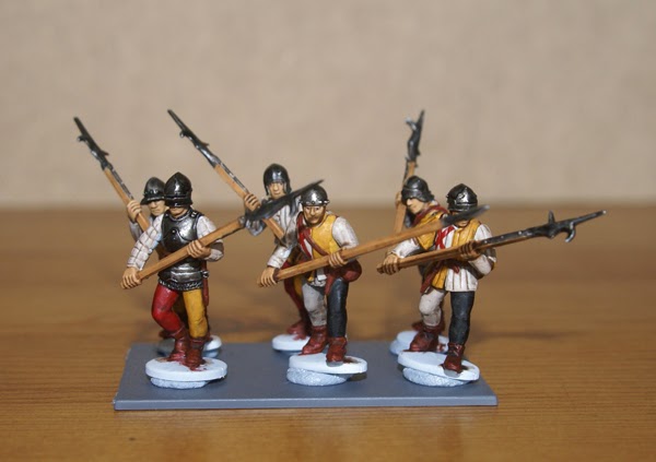
Among all the dirty white and muted browns, some of the chaps leap out. One such is the chap in centre front, with his 'look at me' parti hose and jacket (under padded jack). When temporarily grouping the minis for photographing, I should pay more attention. I've put three boar spears and three identical bills in the same group of six.

More of the colourful ones. Red / white / blue makes a great combination for unit colours, even when it's just for accents (as here). Makes for some great flags too.

Now to the other end of the scale. I got the Tiptoft scheme from a reenactment society, and it looks great. It's basically quartered yellow / white, but with a great big red saltire in the upper left. This made it much more interesting to paint, though I still messed about with 'alternative whites'.

Not all the body mouldings were suitable for the livery, so some (like the chap front left) got plain white padded jacks, but 'Tiptoft themed' hose. This preserves the overall red / yellow / white unit colours. As you can see from the other two front-rankers, I stuck to neutrals for most of the hose.

The saltire is easy enough to paint freehand, you just go straight from corner to corner, but this is less straightforward when the soldier has pushed his livery coat open to show off his breastplate. After experimentation (crumpling paper flags!), it ends up looking something like a letter 'I' with dents in the top and bottom serif. Different issues were encountered with the brigandine (middle chap). No brush wants to paint straight when bobbling over rivets. In the end, after botching two and having to correct them, I hit on a knack. Paint the line between the rivets only, then go back and touch in the rivets. Of course, if you're doing fancy coloured rivets (exposed metal or contrasting paint) you'd do this anyway.
Eagle eyed regulars will notice that the skin tone is different to my usual 'soldiering in summer'. This one is a Games Workshop colour (Kislev Flesh), but I probably won't use it much in future. It works pretty well over white primer (as with these chaps) but even two coats over grey primer still looked corpse-like. Maybe I'll use it for fresh corpses, or an army of Nu-rock teenagers.
They look great - nice job on ranking them up too - a bit tricky with the polearms.
ReplyDeleteThanks! Beats me how they didn't end up decapitating each other by accident.
ReplyDelete